Payment Requests


Role
Sole UX Designer
Project Summary
Topline Pro uses AI to help service professionals market and operate their companies.
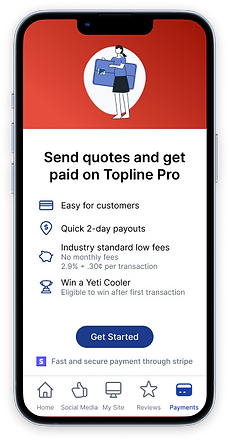
Attempting to add a revenue stream for Topline Pro, PM’s wanted to enable service professionals to collect payment in-app. The app, which was solely focused on marketing functions, would now be moving towards an operational activity.
Problem Statement
How can we make invoicing customers as simple as possible?
Users have many different applications, for many purposes. The long term vision is to make our app an all-in-one resource for them. Allowing users to quickly and easily invoice customers and collect payments, seemed like a good place to start.
Goals
While the team was not used to coming up with success metrics, I encouraged, and worked with my product manager to identify success metrics and create a path to tracking the metrics. Some of these metrics were:
-
10% of users adopt feature in first 3 months
-
60% of users who begin setup, complete it
-
90% of users who make it through setup complete a payment within a month
Research
Before even beginning the project, we wanted to speak with users to understand how they were receiving payment currently, what rates they were receiving, and to see satisfaction with existing solutions. After speaking to five users, the general consensus was that users were “fine” with existing solutions, that they just wanted to use what was easiest for their users (without paying astronomical fees), and that around 3% transaction fee was normal and acceptable.
"I'll use whatever is easiest for my customers. Venmo, credit card, check... whatever"
Design Decisions
Setup
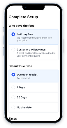
Setup is done partially through Stripe. We decided to add screens to our UI to set expectations, make it a delightful experience, and to collect metadata from users to understand defaults and preferences.
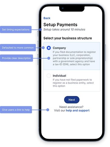
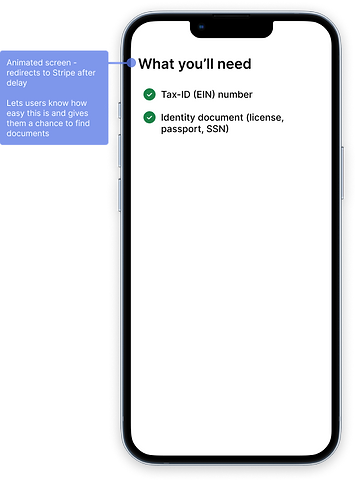
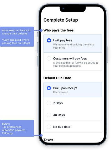
We also needed to untangle Stripe’s setup to understand all of the non-happy-paths that existed. There would be specific verification steps, lag time between setup steps, and follow up needed from users. Transparency and communication would be a big focus here.


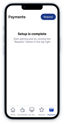
IA
With a navigation overhaul in the backlog, getting it into the navigation in a visible spot was a primary goal.


As a proponent to remove "More" as a navigation item, it was easy to replace that with "Payments" and find alternative locations for the varying functionality that existed in "More". Knowing this feature would be a primary function of the app, meant that it would likely stay put in future nav revisions.
Payments Page
I always think about users primary, secondary and tertiary goals when designing.
Here, the users primary goal is request a payment.
Secondary is to see if payments have been completed.
Tertiary is to find specific payments and view the details.
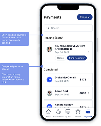
To allow users to see if payments have been completed, I split the page into pending payments (up top), and completed payment (below) and allowed users to follow up quickly.
To find payments easily, I wanted to let users search by the primary parameters (customer name, amount, date, items).
Requesting Payment
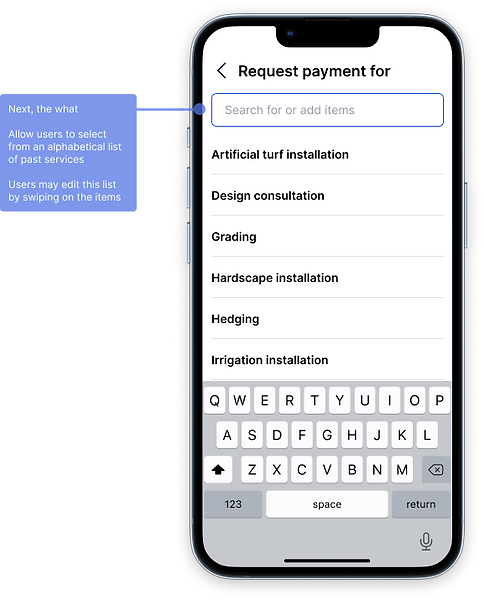
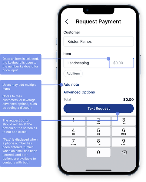
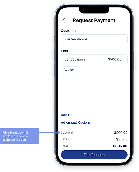
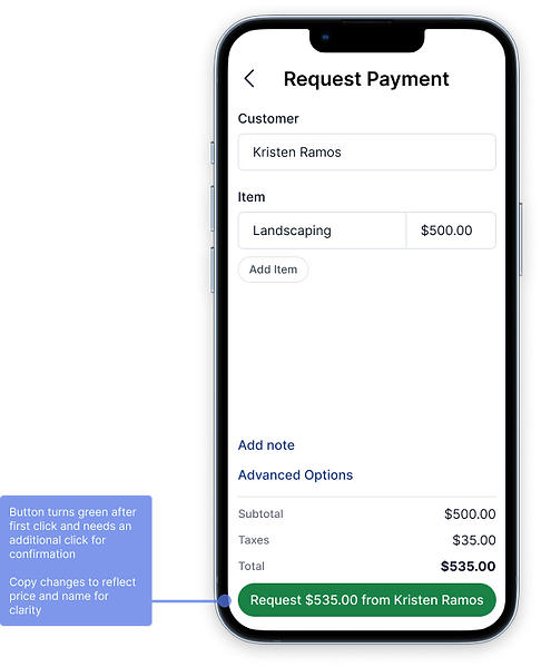
For our users primary goal, we wanted to guide them through necessary steps in an order that matches the mental model that exists across major payment platforms like Paypal, Venmo, Zelle and Revolut. By doing this, we can eliminate unnecessary clicks, and serve up the right information at the right time.

Follow-up Work
1. Allow users to send quotes for work to be done.
2. Add metrics for users to be able to quickly see how much money they’ve made and breakdown their work.